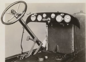
Now, Dashboard! Now, Dancer!
Are you using a dashboard to assess your organization’s performance? At CDL, we decided to give this approach a try. This time last year, I was beginning the necessary background work, including gathering initial data that would help me understand what kinds of reporting would be possible. I was also looking at open source tools that were available to automate charting.

By early spring, I had a manual process in place, and in July, we went live with the automated charting, showing the trends on 11 measures from our 5 programs. The measures fall into two categories: numbers of objects and usage volume. We can add new measures easily, although we are careful about adding too many. After all, a dashboard can only get so large before the driver is too distracted to see the road ahead.
I mentioned in a July post that the tool we use is AmCharts, a tool that can extract data from .csv or .xml files and then display the data in configurable Flash charts, graphs and tables. My partner in this implementation has been Seán O’Hara of CDL’s Infrastructure and Applications Support Group. In addition to developing the dashboard reports, Seán also created an interface for the data suppliers to use to upload their monthly statistics. He’s done great work,and I’m so grateful for his help!
I also want to thank the data suppliers, who month after month, provide the data to create the reports. This is a sizable group: Stephen Abrams, Sherri Berger, Jason Colman, Bobbi Perkins-Hill, Lisa Schiff, and Leslie Wolf. Most, if not all, of these folks have developed metrics and even dashboards at the program level. We are all learning from each others’ experiments and experiences with performance measures.
Have you tried any experiments along these lines?
